
Printing & Packaging · 2026-10-10
Brown Kraft Can Print Bright—But Only If Buyers Specify These 6 Things
A recent brown-paper packaging case achieved strong brand color with digital printing and a white underprint. The real lesson for buyers is not that every kraft sheet prints the same—it is that substrate, ink, artwork and approval standards must be specified together.
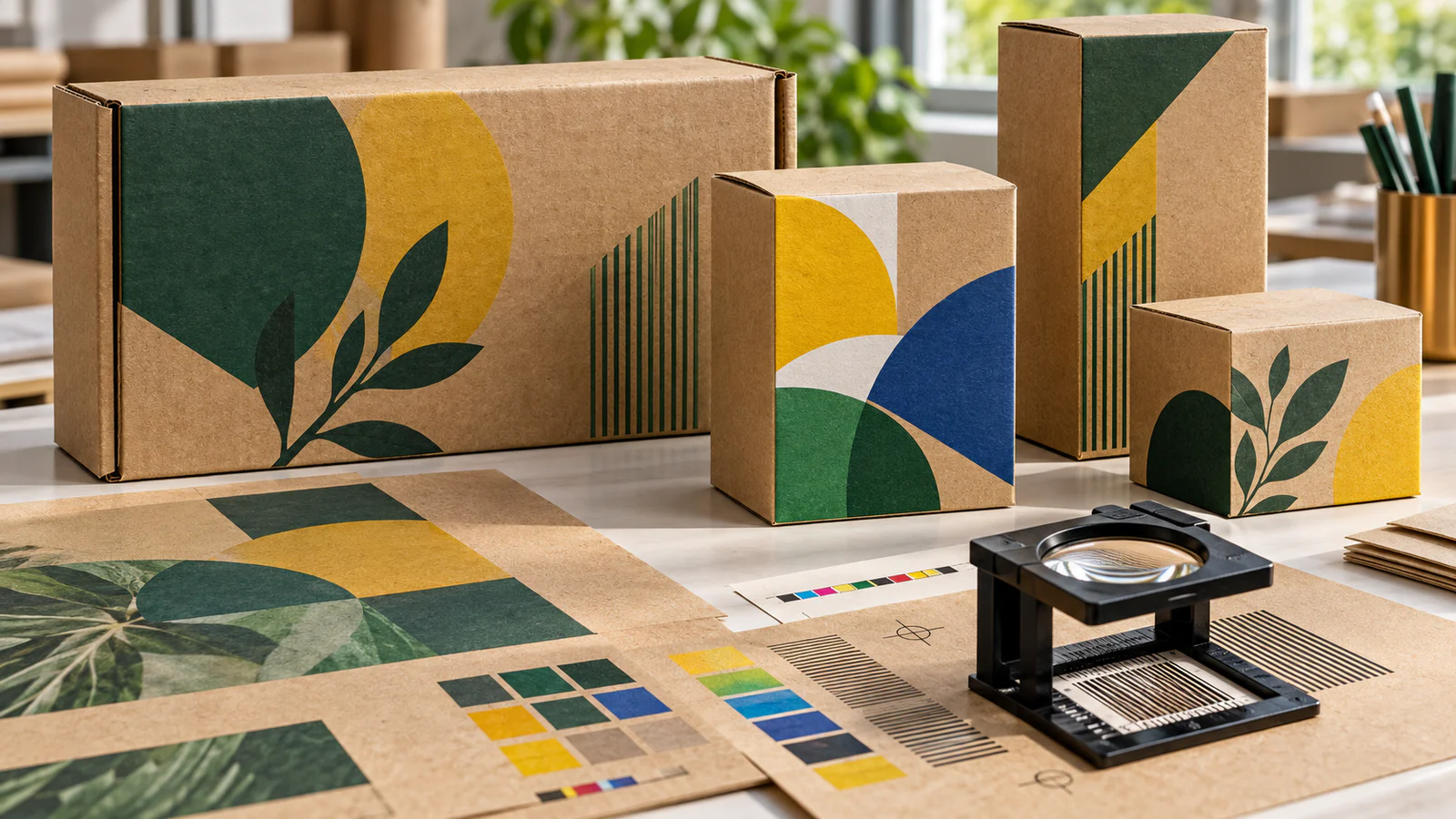
Brown kraft packaging is usually chosen for its natural fibre appearance, strength and straightforward material story. Its visual limitation is equally familiar: transparent process inks allow the brown substrate to influence every printed colour. Pale shades lose brightness, photographs become warmer and a brand colour approved on a white screen can look very different on the finished box.
A packaging case published by Mondi on 5 October 2026 shows why buyers should revisit that assumption. For a Kärcher product launch, the supplier used multi-colour digital printing with an optional white underprint on a brown paper substrate. According to the official Mondi case study, the system reproduced bright brand colours, fine details, small text and EAN barcodes without conventional printing plates.
The useful procurement lesson is not that all kraft packaging can now reproduce any design. It is that print result depends on a complete specification: the exact paper shade and surface, print process, white-ink strategy, artwork preparation, finishing and approval method.
Here are six points to define before ordering digitally printed kraft packaging.
1. Approve the Actual Kraft Shade, Not the Word “Brown”
Kraft is not one standard colour. Fibre source, recycled content, production batch, coating and surface treatment can all change its tone. One sheet may look golden and clean; another may be darker, greyer or more visibly fibrous.
That base colour becomes part of the printed image because CMYK inks are normally translucent. Packlane's printing guidance notes that the material colour can affect digital CMYK appearance, particularly on kraft substrates. A colour target created on a white monitor or proof paper therefore cannot be treated as the final result.
For a reliable RFQ, ask the supplier to state:
- paper grade and fibre composition;
- nominal GSM or board construction;
- top-side colour or agreed physical shade sample;
- coated or uncoated print surface;
- acceptable shade variation between production lots.
When colour consistency is important, keep an approved production sample—not only a PDF—as the reference for repeat orders. Review the available kraft paper specifications before matching the material to the printing process.
2. Decide Where White Underprint Is Necessary
White ink can work as a controlled base layer. It reduces the influence of the brown substrate beneath selected graphics, helping yellow, blue, green, pastel tones and photographic areas appear cleaner and more opaque. It can also be used as a visible design colour.
But printing white under every element is not automatically better. It adds ink coverage, production time and registration requirements, while removing some of the natural kraft character that the brand may want.
Separate the artwork into three practical zones:
| Artwork zone | Recommended treatment |
|---|---|
| Natural kraft areas | No white; let the paper remain visible |
| Dark text and simple line art | Test direct CMYK or spot colour first |
| Bright colours, photos and pale details | Evaluate a selective white underprint |
Ask the printer whether white is printed as a single layer, multiple passes or a variable-density channel. The answer affects opacity, edge registration and cost.
3. Match the Print Method to Quantity and Artwork
Digital printing removes plates and supports version changes, short or medium production runs and demand-driven ordering. Mondi's case highlighted computer-to-print production as a way to avoid plates and reduce surplus. That is valuable when a buyer needs several languages, seasonal designs, regional versions or a launch quantity before full-scale production.
Digital is not automatically the lowest-cost option for every order. Flexographic printing can be efficient for large quantities and simple solid-colour designs, while offset or litho-laminated production can suit high-detail retail graphics and longer runs. The decision should include setup cost, unit cost, changeover frequency, required colour control and the board structure—not only the print label.
Before requesting a price, tell the supplier:
- total quantity and number of artwork versions;
- finished box or sheet size;
- percentage of ink coverage;
- required variable data, language or SKU changes;
- expected repeat-order volume;
- whether a matching sample from another process exists.
This gives the converter enough information to compare digital, flexo and offset routes honestly.
4. Prepare Artwork for Brown Paper, Not for a White Screen
An attractive RGB design can fail after conversion to CMYK and placement on brown paper. Light colours may become dull, shadows can close up and low-contrast text may disappear. Fine reversed text over a white layer can also expose registration errors.
Prepare the artwork with the actual substrate in mind:
- Convert images and brand colours using the printer's requested CMYK profile.
- Create a separate named layer for white underprint.
- Define knockout, overprint and trapping rules with the converter.
- Check minimum text size, line width and barcode quiet zones.
- Avoid judging colour only from an emailed PDF.
The Packaging Insights report on the Mondi development notes that the case required both strong colour contrast and sharp rendering of small fonts and barcode details. Those are separate quality targets and should appear separately in the approval checklist.
5. Test Finishing and Converting on the Printed Structure
Printing is only one stage. Creasing, folding, die-cutting, gluing, varnishing and lamination can alter appearance and performance. Heavy ink or white layers near folds may crack. A varnish can deepen colour and change gloss. Adhesion may differ between a smooth coated face and a porous uncoated kraft surface.
Ask for a converted sample when the package includes:
- dense ink coverage across crease lines;
- white ink under small text or fine graphics;
- foil, embossing, spot varnish or lamination;
- tight folds, reverse folds or small glue flaps;
- scannable barcodes or QR codes near curved or folded areas.
For premium cartons, compare whether a smoother folding box board or C2S art board card is a better base when photographic reproduction matters more than the natural kraft appearance. Material choice should follow the final brand and converting requirement.
6. Define the Approval Standard Before Production
“Make it bright” is not a measurable instruction. A good purchase order describes how colour, detail and consistency will be accepted.
Use an approval sequence with increasing confidence:
- Digital artwork check: dimensions, dieline, layers, language and barcode data.
- Substrate drawdown or colour strip: direct comparison of key colours with and without white.
- Printed flat proof: evaluation of colour, small text, gradients and registration.
- Converted prototype: confirmation of folds, glue, rub resistance and final appearance.
- Signed reference sample: production standard for the order and future repeats.
State the viewing light, measurement method and acceptable tolerance when exact brand colour is critical. Also confirm whether the same press, ink set, paper grade and finishing route will be used for repeat orders.
A Procurement Checklist for Digitally Printed Kraft Packaging
Send the following information with the RFQ so suppliers quote the same job:
- package style, dimensions and packed-product weight;
- kraft grade, GSM, flute or board construction;
- natural shade reference and permitted lot variation;
- printing process and number of artwork versions;
- CMYK, spot colour and selective-white requirements;
- total ink coverage and finishing operations;
- minimum readable text and barcode requirements;
- target quantity, repeat forecast and delivery market;
- physical proof and converted-sample requirement;
- signed master sample for production approval.
Buyers working across cartons, bags and retail displays can also review our packaging and printing solutions to connect material choice with the converting route.
What This Week's Packaging News Really Changes
The recent case does not remove the limitations of brown paper. It makes them more manageable. Selective white, modern digital equipment and substrate-specific artwork can produce a stronger result, especially for multiple versions or demand-driven production. The buyer still needs to approve the real material and converted pack.
The safest conclusion is simple: do not ask whether kraft can print brightly; ask which kraft, which ink build, which artwork file and which approved sample will produce the required result.
To evaluate a new kraft packaging project, send YOUNGSUN PAPER the package style, printing method, target GSM, quantity and destination market. We can help organise suitable paper samples for print and converting trials; the final colour standard should be approved with the selected printer and finished package.
Frequently Asked Questions
Can Digital Printing Produce Bright Colours on Brown Kraft Paper?
Yes, but the result depends on paper shade, surface, ink system, artwork and whether a selective white underprint is used. Always approve a physical proof on the intended substrate.
Is White Ink Required for Every Kraft Packaging Design?
No. Dark solid colours and simple line art may work directly on kraft. White is most useful where bright, pale or opaque graphics are required, but it should be tested and specified selectively.
Is Digital Printing Better Than Flexographic Printing for Kraft?
Neither process is universally better. Digital printing suits shorter runs, multiple versions and variable data, while flexo can be economical for larger runs and simpler designs. Compare the complete job and repeat forecast.
What Sample Should a Buyer Approve Before Mass Production?
Approve at least one printed sample on the actual kraft grade. For critical packaging, approve a converted prototype and retain a signed master sample showing colour, finishing, folds and barcode performance.