
Design · 2026-07-19
Paper as a Design Material: How Surface, Texture, Color, and Finish Shape Brand Perception
Paper is not a neutral carrier of graphics. Its surface, texture, color, and finish actively shape how people perceive a brand before they read a single word. This guide explores paper as a design material.
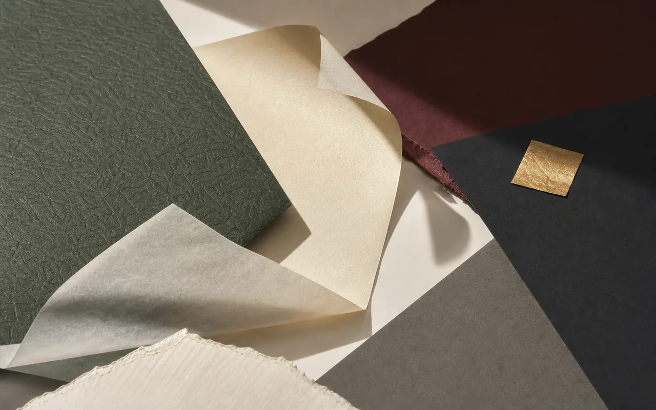
Paper is often treated as the background — the invisible substrate that carries ink. But in premium packaging and print design, the paper itself is half the design. Before anyone reads a word of copy or recognizes a logo, their fingers have already touched the surface. Their eyes have already registered whether the light reflects off a gloss coat, sinks into an uncoated texture, or shimmers across a pearlescent finish.
This guide is written for designers, creative directors, and brand managers who want to understand paper not as a commodity specification but as a design material with its own vocabulary, behavior, and expressive range.
The Material First Impression
Consider two boxes sitting side by side on a retail shelf. Both are the same dimensions. Both carry the same brand logo. One is wrapped in standard coated paper with a smooth glossy finish. The other is covered in soft touch paper with a velvet-matte surface, the logo debossed into the texture, and a subtle pearlescent shimmer catching the light along the edges.
Which one says "premium" before the customer reads a single word?
Paper choice communicates brand values through sensory channels that copy and graphics cannot reach alone:
- Touch — Is the surface warm or cold? Smooth or textured? Soft or crisp?
- Sight — Does it reflect light or absorb it? Is the color through-dyed or surface-printed? Does it shimmer or stay matte?
- Sound — Does the paper rustle with stiffness or fold quietly? Does the box lid make a satisfying sound when it closes?
- Weight — Does the board feel substantial in the hand, or light and disposable?
These perceptions form within milliseconds and set the expectation for the product inside. A luxury watch in a flimsy box feels less valuable. An organic skincare product in high-gloss plasticized packaging feels contradictory. The paper is the first material evidence of the brand's promise.
Surface Language: Gloss, Matt, and Everything Between
Gloss Coated
Gloss-coated papers and boards — such as C2S art board and coated folding box board — reflect light efficiently. They make colors pop, deepen blacks, and create a polished, commercial finish. Gloss surfaces are the default choice for retail packaging where shelf visibility matters: cosmetics, consumer electronics, mass-market confectionery.
Design considerations for gloss surfaces:
- Pros: Maximum color saturation, sharp image reproduction, high contrast, perceived as clean and modern.
- Cons: Fingerprints and scratches are visible; can feel generic if overused; may conflict with "natural" or "craft" brand positioning.
- Best for: Cosmetics, electronics, mass retail, promotional printing, catalog covers.
Matt Coated
Matt-coated surfaces — available in C2S art matt paper and label paper — reduce glare while maintaining print quality. They feel more refined, less commercial. Matt surfaces are increasingly preferred in premium sectors because they photograph well (no glare spots) and feel more tactile.
Design considerations for matt surfaces:
- Pros: Elegant, low-glare, photographs beautifully, feels more premium and less mass-market.
- Cons: Slightly less color pop than gloss; can scuff if not laminated; some matt coatings show finger oils.
- Best for: Premium packaging, editorial design, luxury catalogs, boutique brand boxes.
Uncoated
Uncoated papers — such as woodfree offset paper and kraft paper — have an open fiber surface that absorbs ink and feels warm and natural to the touch. They communicate honesty, simplicity, and environmental awareness.
Design considerations for uncoated surfaces:
- Pros: Natural tactile warmth, eco-aesthetic, excellent writability, strong craft/artisan association.
- Cons: Lower print resolution (ink spreads into fibers), colors appear muted, less durable without lamination.
- Best for: Stationery, notebooks, natural product packaging, eco-brands, food bags, art books.
The Surface-to-Brand Translation
| Brand Position | Recommended Surface | Why |
|---|---|---|
| Ultra-luxury | Soft touch or leather paper | Tactile, distinctive, memorable |
| Modern premium | Matt coated + spot UV or foil | Refined but not flashy |
| Natural / organic | Uncoated kraft or textured uncoated | Honest, warm, sustainable feel |
| Mass retail | Gloss coated duplex board | Bright, visible, cost-effective |
| Fashion / cosmetics | Pearlescent or metallic accents | Glamour, light-play, Instagram-ready |
| Minimalist / editorial | Uncoated with bold typography | Quiet confidence, substance over style |
Texture: The Dimension Print Cannot Reach
Texture is the most underused tool in packaging design — and the most powerful. A printed image of linen cannot replace the feel of real linen-embossed paper. A photograph of leather grain cannot replicate the tactile depth of leather paper. Texture adds a dimension that screens cannot simulate and competitors cannot easily copy.
Embossed Textures
Embossed paper carries a permanent three-dimensional pattern pressed into the surface under heat and pressure. The patterns are physical, not visual. They catch light differently at every angle, invite touch, and signal that someone invested in the material.
Common embossed patterns and their associations:
- Linen — Classic, refined, heritage. Used for stationery, book covers, wedding invitations.
- Canvas — Artistic, textured, creative. Used for art prints, portfolio covers, creative brand packaging.
- Woodgrain — Natural, organic, warm. Used for craft product packaging, furniture tags, eco-brands.
- Felt / Laid — Traditional, artisanal, hand-crafted feel. Used for letterpress cards, certificates, premium stationery.
- Custom patterns — Brand-specific textures (monograms, logos, proprietary patterns) that become part of the visual identity system.
Leather and Suede Finishes
Leather paper replicates the grain, depth, and hand-feel of genuine leather without animal materials. It is available in crocodile, calf, ostrich, and pebble grain patterns. The surface can be colored in classic leather tones — black, cognac, burgundy, navy — or custom-matched to brand palettes.
Soft touch paper creates a velvet-smooth, almost rubbery surface that people instinctively want to stroke. It deepens printed blacks, resists fingerprints, and adds a contemporary luxury feel that gloss lamination cannot achieve.
Design rule: texture and finish should reinforce the brand idea, not fight it. A leather-textured box for a vegan skincare brand is a mixed message. A soft-touch surface for a rugged outdoor brand may feel too delicate. The material should tell the same story as the brand.
Color: Through-Dyed, Surface-Printed, and Metallic
Through-Dyed Paper
Through-dyed paper — such as black paper and color card paper — has pigment distributed throughout the entire sheet, not just on the surface. When you cut, fold, crease, or tear through-dyed paper, the edge reveals the same color as the surface.
Why this matters for design:
- Clean edges on die-cut shapes — No white line at cut boundaries.
- Crease and fold integrity — The color does not crack or expose a different core.
- Premium unboxing — The inside of a rigid box wrapped in through-dyed paper matches the outside.
- Perceived quality — Through-dyed color communicates that the material itself is valuable, not just coated to look that way.
Black paper is the most widely used through-dyed paper in luxury packaging. It creates dramatic contrast with gold or silver foil stamping and provides a deep, light-absorbing background that makes metallic accents appear to float.
Metallic and Pearlescent
Metallic papers — such as gold and silver card paper — use vacuum metallization or foil lamination to create mirror-like reflective surfaces. They are the most visually assertive paper choice available.
Pearlescent paper uses mica-based pigments to create a softer, shifting shimmer rather than a hard mirror reflection. The effect changes with viewing angle, adding depth and movement to packaging surfaces.
Design considerations for metallic and pearl surfaces:
- Less is more — A full metallic box can overwhelm. Consider metallic accents, bands, inserts, or interior linings.
- Print compatibility — Metallized surfaces may require specific inks or printing methods. Always test before production.
- Photography — Metallic surfaces are challenging to photograph for e-commerce. Consider how the packaging will appear online.
Color Tissue and Translucency
Color tissue paper adds a final layer of color and texture to the unboxing experience. It is the first thing a customer touches when they open a box. A carefully chosen tissue color — matching the brand palette or creating deliberate contrast — turns a practical protective layer into a designed moment.
Finishing Techniques: The Final Layer of Intent
Paper selection and finishing techniques are not separate decisions. The paper substrate determines which finishes are possible and what they look like. A foil stamp on uncoated kraft looks completely different from the same foil on gloss-coated board.
Foil Stamping
Hot foil stamping applies a metallic or pigmented foil to the paper surface under heat and pressure. The result is a reflective, premium mark that cannot be achieved with ink alone.
Foil works best on:
- Smooth, coated surfaces — Maximum reflectivity, clean edges.
- Black paper — Maximum contrast, especially with gold or rose gold foil.
- Soft touch paper — Creates a sophisticated matte-metallic juxtaposition.
- Lightly textured surfaces — Foil sits on top of the texture, creating an interesting mixed finish.
Foil is less effective on:
- Deeply textured or uncoated papers — Foil may not adhere uniformly; edges may appear irregular.
- Very lightweight papers — Heat and pressure can distort the sheet.
Embossing and Debossing
Blind embossing (no ink or foil) creates a raised or recessed design using only the paper surface. The effect is subtle, tactile, and communicates understated luxury. It works especially well on thick grey board structures and embossed paper covers.
Debossing (pressed into the surface) is more common than embossing (raised from the surface) for packaging because it protects the raised area from scuffing during handling.
Spot UV and Coatings
Spot UV varnish applies a high-gloss coating to selected areas, creating contrast between gloss and matt zones on the same surface. It is most effective when the base paper has a matt finish — the gloss UV areas pop dramatically.
Die-Cutting and Structural Design
The paper choice influences what structural shapes are possible. Heavy grey board (0.5–4.0 mm) can be die-cut into rigid box components, game board pieces, and structural inserts. Lightweight tracing paper can be die-cut into delicate overlays and sleeves. The material determines the structural vocabulary available to the designer.
Choosing Paper for the Design Outcome, Not the Spec Sheet
A common mistake in paper sourcing is to select by GSM and price before defining the design intent. A more effective sequence is:
- Define the sensory goal — What should the customer feel, see, and perceive when they encounter this packaging or printed piece?
- Identify the surface language — Gloss, matt, uncoated, or specialty finish? What does the brand's visual identity require?
- Select texture and color — Does the brand need through-dyed color? An embossed pattern? A metallic accent?
- Choose finishing techniques — Foil, emboss, spot UV, or a combination?
- Now specify GSM and format — The substrate serves the design, not the other way around.
This sequence ensures the paper decision is driven by creative intent, not by spreadsheet optimization.
Translucency, Overlay, and the Power of Reveal
Tracing paper occupies a unique position in paper design. Its translucency — approximately 56%–73% depending on grammage — creates layered visual effects that opaque papers cannot achieve.
Design applications of translucency:
- Packaging overlays — A translucent tracing paper sleeve over a printed box creates depth and a "reveal" moment.
- Book and brochure inserts — Partially obscuring the page beneath creates visual intrigue.
- Invitation suites — A translucent outer layer with the event details printed beneath.
- Belly bands — A translucent band that wraps around a box without hiding the surface beneath.
Translucent papers work best when the designer thinks in layers. The paper is not the final surface — it is a filter, a curtain, a moment of anticipation.
Sustainable Design: Material Honesty as an Aesthetic
Sustainability in paper design is not only about certification. It is also an aesthetic. The visual language of recycled, uncoated, natural-toned papers has become a design style in its own right — what some call "material honesty."
Kraft paper typifies this approach. Its natural brown fiber appearance, uncoated texture, and visible fiber pattern communicate environmental responsibility without needing a logo or a claim. Brands in food, fashion, lifestyle, and personal care increasingly choose kraft and recycled papers because the material itself conveys the sustainability message.
Grey board — made from 100% post-consumer recycled fiber — is another material that carries its sustainability credentials visibly. When designers leave portions of grey board exposed (rather than covering every surface with printed wrap), the board itself becomes part of the brand's sustainability story.
Design consideration: FSC certification logos are important, but the material can communicate sustainability more powerfully than any printed label.
Practical Considerations: From Design Concept to Production Reality
Test Before You Commit
The most beautiful paper sample can fail in production. Always test:
- Print adhesion — Does the ink sit on the surface or absorb in? On textured or specialty papers, results vary dramatically.
- Folding and creasing — Does the paper crack along the fold? Through-dyed papers and thick boards are more prone to cracking without proper scoring.
- Gluing and adhesion — Does the adhesive bond to the surface? Soft-touch coatings and metallic surfaces can resist standard adhesives.
- Die-cutting — Do cut edges stay clean? Laminated and coated boards may delaminate if the die is dull or pressure is wrong.
- Foil stamp release — Does the foil adhere cleanly? Test on the actual production stock, not a substitute.
Communicate with Your Supplier
Paper suppliers and converters can advise on material selection for specific production processes. When requesting samples, share:
- The design intent and brand positioning
- The converting processes (printing, die-cutting, gluing, foil stamping, embossing)
- The expected production volume
- The target market and any regulatory requirements
A good supplier will recommend grades that match both the creative vision and the production reality.
Conclusion
Paper is not a passive substrate. It is an active design material with its own language of surface, texture, color, and finish. For designers and brands, learning to speak that language means creating packaging and print that communicates before anyone reads a word.
The most effective paper choices are not the most expensive or the most unusual. They are the choices that align the sensory experience of the material with the values and identity of the brand. When paper and brand speak the same language, the result is not just packaging — it is presence.
FAQ
What is the best paper finish for luxury packaging?
Soft touch paper, leather paper, and matt-coated papers with foil stamping or embossing are the most common choices for luxury packaging. The specific choice depends on the brand's visual identity and tactile goals.
How do I choose between gloss and matt paper?
Gloss maximizes color saturation and shelf visibility. Matt communicates refinement and photographs better for e-commerce. Choose based on where and how the customer will encounter the packaging.
What paper works best with foil stamping?
Smooth, coated papers produce the cleanest foil results. Black paper with gold foil creates the highest contrast. Soft touch paper with foil creates an interesting matte-metallic tension.
Can textured paper be printed?
Yes, but results depend on the texture depth, ink, and printing method. Deep textures may cause uneven ink coverage. Always test before production.
What is through-dyed paper and why does it matter?
Through-dyed paper has pigment throughout the entire sheet, not just on the surface. It matters because cut edges, creases, and folds show no white line — a premium detail that elevates packaging quality.
Is uncoated paper suitable for luxury design?
Yes. Uncoated papers can communicate understated luxury, craftsmanship, and material honesty. They work especially well for brands with natural, artisanal, or minimalist positioning.
Related Products and Guides
- Soft Touch Paper — velvet-smooth luxury surface
- Leather Paper — animal-free leather texture
- Pearlescent Paper — iridescent shimmer finish
- Embossed Paper — 3D textured patterns
- Black Paper — through-dyed luxury black board
- Gold & Silver Card Paper — metallic reflective surface
- Tracing Paper — translucent overlay material
- Grey Board — recycled structural board
- Kraft Paper — natural uncoated packaging paper